A Complete Guide to Flexbox
Properties for the Parent (flex container)
display: this defines a flex container; inline or block depending on the given value. It enables a flex context for all its direct children.
flex-direction
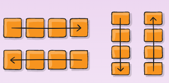
This establishes the main-axis, thus defining the direction flex items are placed in the flex container. Flexbox is (aside from optional wrapping) a single-direction layout concept. Think of flex items as primarily laying out either in horizontal rows or vertical columns.

-
row (default): left to right in ltr; right to left in rtl
-
row-reverse: right to left in ltr; left to right in rtl
-
column: same as row but top to bottom
-
column-reverse: same as row-reverse but bottom to top
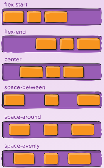
flex-wrap
By default, flex items will all try to fit onto one line. You can change that and allow the items to wrap as needed with this property.
Its values:
-
nowrap (default): all flex items will be on one line
-
wrap: flex items will wrap onto multiple lines, from top to bottom.
-
wrap-reverse: flex items will wrap onto multiple lines from bottom to top.
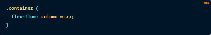
flex-flow
This is a shorthand for the flex-direction and flex-wrap properties, which together define the flex container’s main and cross axes. The default value is row nowrap.
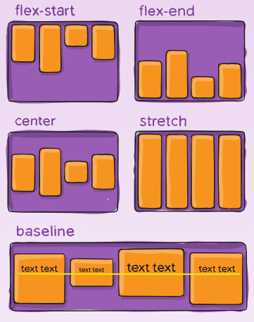
justify-content
This defines the alignment along the main axis. It helps distribute extra free space leftover when either all the flex items on a line are inflexible, or are flexible but have reached their maximum size. It also exerts some control over the alignment of items when they overflow the line.
flex-start (default): items are packed toward the start of the flex-direction.
flex-end: items are packed toward the end of the flex-direction.
start: items are packed toward the start of the writing-mode direction.
end: items are packed toward the end of the writing-mode direction.
center: items are centered along the line
space-between: items are evenly distributed in the line; first item is on the start line, last item on the end line
space-around: items are evenly distributed in the line with equal space around them. Note that visually the spaces aren’t equal, since all the items have equal space on both sides. The first item will have one unit of space against the container edge, but two units of space between the next item because that next item has its own spacing that applies.
space-evenly: items are distributed so that the spacing between any two items (and the space to the edges) is equal.
align-items
This defines the default behavior for how flex items are laid out along the cross axis on the current line. Think of it as the justify-content version for the cross-axis (perpendicular to the main-axis).