Table of content
|Read No. | Name of chapter|
|:———: |:————–:|
|14a|Transforms|
|14a|Transitions & Animations|
# Transforms
2D Rotate
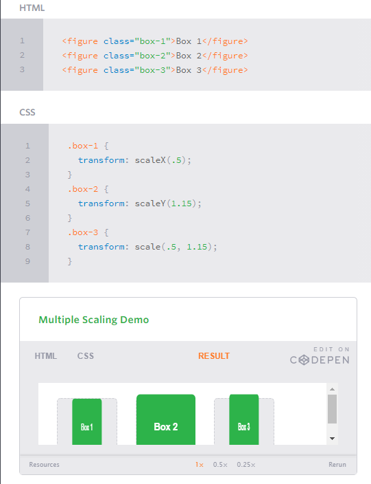
2D Scale
2D Translate
The translate value works a bit like that of relative positioning, pushing and pulling an element in different directions without interrupting the normal flow of the document. Using the translateX value will change the position of an element on the horizontal axis while using the translateY value will change the position of an element on the vertical axis.As with the scale value, to set both the x and y axis values at once, use the translate value and declare the x axis value first, followed by a comma, and then the y axis value.
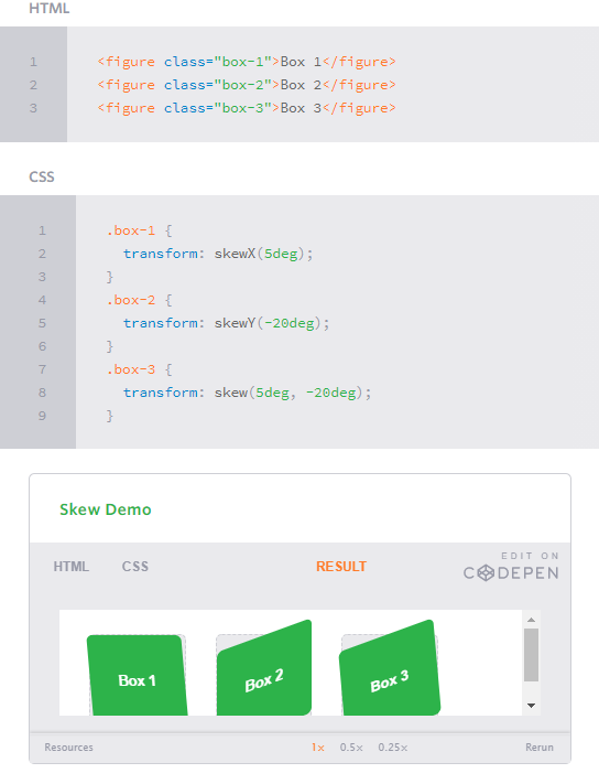
2D Skew
Perspective
Perspective Depth Value
The perspective value can be set as none or a length measurement. The none value turns off any perspective, while the length value will set the depth of the perspective. The higher the value, the further away the perspective appears, thus creating a fairly low intensity perspective and a small three-dimensional change. The lower the value the closer the perspective appears, thus creating a high intensity perspective and a large three-dimensional change.
3D Rotate
3D Scale
Backface Visibility
Transitions & Animations
Transitions
Transitional Property
The transition-property property determines exactly what properties will be altered in conjunction with the other transitional properties. By default, all of the properties within an element’s different states will be altered upon change. However, only the properties identified within the transition-property value will be affected by any transitions.
Transition Duration
The duration in which a transition takes place is set using the transition-duration property. The value of this property can be set using general timing values, including seconds (s) and milliseconds (ms). These timing values may also come in fractional measurements, .2s for example.
Transition Timing
The transition-timing-function property is used to set the speed in which a transition will move. Knowing the duration from the transition-duration property a transition can have multiple speeds within a single duration. A few of the more popular keyword values for the transition-timing-function property include linear, ease-in, ease-out, and ease-in-out. The linear keyword value identifies a transition moving in a constant speed from one state to another. The ease-in value identifies a transition that starts slowly and speeds up throughout the transition, while the ease-out value identifies a transition that starts quickly and slows down throughout the transition. The ease-in-out value identifies a transition that starts slowly, speeds up in the middle, then slows down again before ending.
Transition Delay
On top of declaring the transition property, duration, and timing function, you can also set a delay with the transition-delay property. The delay sets a time value, seconds or milliseconds, that determines how long a transition should be stalled before executing. As with all other transition properties, to delay numerous transitions, each delay can be declared as comma separated values.
Animations
Transitions do a great job of building out visual interactions from one state to another, and are perfect for these kinds of single state changes. However, when more control is required, transitions need to have multiple states. In return, this is where animations pick up where transitions leave off.
Animations Keyframes
To set multiple points at which an element should undergo a transition, use the @keyframes rule. The @keyframes rule includes the animation name, any animation breakpoints, and the properties intended to be animated.
It is important to note, as with transitions only individual properties may be animated. Consider how you might move an element from top to bottom for example. Trying to animate from top: 0; to bottom: 0; will not work, because animations can only apply a transition within a single property, not from one property to another. In this case, the element will need to be animated from top: 0; to top: 100%;.
Animation Name
Once the keyframes for an animation have been declared they need to be assigned to an element. To do so, the animation-name property is used with the animation name, identified from the @keyframes rule, as the property value. The animation-name declaration is applied to the element in which the animation is to be applied to.
Animation Duration, Timing Function, & Delay
Once you have declared the animation-name property on an element, animations behave similarly to transitions. They include a duration, timing function, and delay if desired. To start, animations need a duration declared using the animation-duration property. As with transitions, the duration may be set in seconds or milliseconds.
A timing function and delay can be declared using the animation-timing-function and animation-delay properties respectively. The values for these properties mimic and behave just as they do with transitions.
Customizing Animations
nimations also provide the ability to further customize an element’s behavior, including the ability to declare the number of times an animation runs, as well as the direction in which an animation completes.
Animation Iteration
By default, animations run their cycle once from beginning to end and then stop. To have an animation repeat itself numerous times the animation-iteration-count property may be used. Values for the animation-iteration-count property include either an integer or the infinite keyword. Using an integer will repeat the animation as many times as specified, while the infinite keyword will repeat the animation indefinitely in a never ending fashion.
Animation Direction
On top of being able to set the number of times an animation repeats, you may also declare the direction an animation completes using the animation-direction property. Values for the animation-direction property include normal, reverse, alternate, and alternate-reverse.
The normal value plays an animation as intended from beginning to end. The reverse value will play the animation exactly opposite as identified within the @keyframes rule, thus starting at 100% and working backwards to 0%.
The alternate value will play an animation forwards then backwards. Within the keyframes that includes running forward from 0% to 100% and then backwards from 100% to 0%. Using the animation-iteration-count property may limit the number of times an animation runs both forwards and backwards. The count starts at 1 running an animation forwards from 0% to 100%, then adds 1 running an animation backwards from 100% to 0%. Combining for a total of 2 iterations. The alternate value also inverses any timing functions when playing in reverse. If an animation uses the ease-in value going from 0% to 100%, it then uses the ease-out value going from 100% to 0%.
Lastly, the alternate-reverse value combines both the alternate and reverse values, running an animation backwards then forwards. The alternate-reverse value starts at 100% running to 0% and then back to 100% again.
Animation Play State
The animation-play-state property allows an animation to be played or paused using the running and paused keyword values respectively. When you play a paused animation, it will resume running from its current state rather than starting from the very beginning again.
Animation Fill Mode
The animation-fill-mode property identifies how an element should be styled either before, after, or before and after an animation is run. The animation-fill-mode property accepts four keyword values, including none, forwards, backwards, and both.
The none value will not apply any styles to an element before or after an animation has been run.
The forwards value will keep the styles declared within the last specified keyframe. These styles may, however, be affected by the animation-direction and animation-iteration-count property values, changing exactly where an animation ends.
The backwards value will apply the styles within the first specified keyframe as soon as being identified, before the animation has been run. This does include applying those styles during any time that may be set within an animation delay. The backwards value may also be affected by the animation-direction property value.
Lastly, the both value will apply the behaviors from both the forwards and backwards values.